PROJECT BRIEF
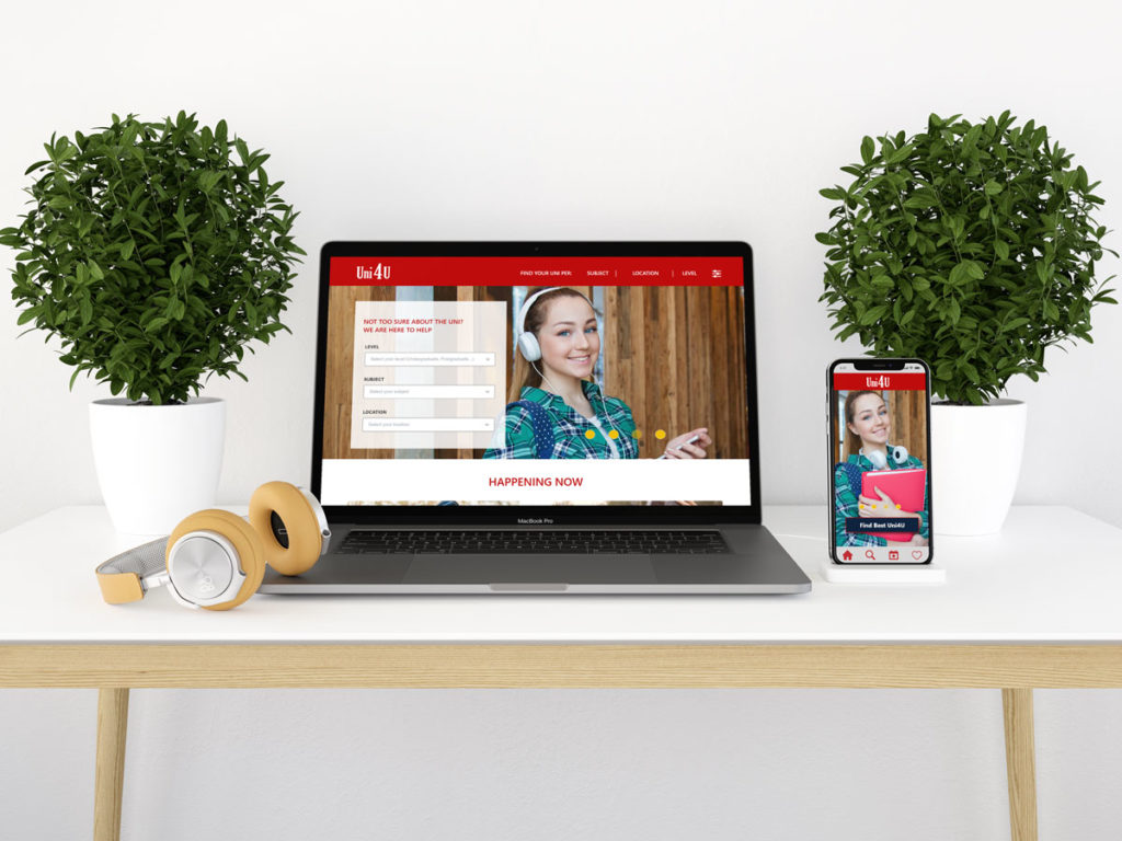
I have designed a responsive website and a mobile app called “Uni4U”. The purpose of this app is to create a one-stop-shop for students and parents/carers to browse and search for their best-fit university, either by subject, location, or both, whilst providing all the information required about the university.
The Problem
I undertook qualitative and quantitative research and liaised with academic staff, support staff, and students working in the HE sector. Analysing students’ enquiries, I noticed that prospective students often struggle to find the information they need about their university of choice, often having to email, phone, or event visit to get the information they need. My target audience tend to enquire about specific areas such as accommodation, bursaries and scholarships and courses availability, wasting precious time and resources to find the required information.
The Goal
My goal was to design an app that is beneficial for students, parents, and carers that is easy to use. I wanted to save the users time, providing one app to find information about all existing universities in the UK, with multiple search parameters.
Responsibilities
Qualitative Research, Note-taking, Usability Testing, UX Design, Visual Design, Wire-framing and Prototyping.
BRANDING
WORKFLOW DIAGRAM
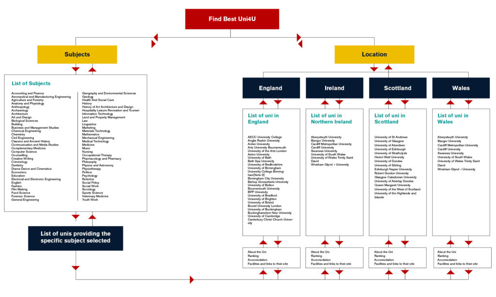
It’s important to map and visualise the needs and the experience I want my users to have. That’s why I have created the flow diagrams that display the complete path my users will take when utilising my product. This flow lays out the user’s movement through the app, mapping out each and every step the user takes—from entry point right through to the final interaction.
WIREFRAMES
Sketching
Before using the software, I have designed some manual sketches, a set of drawings/storyboard, representing the skeleton of the interface of my website and my app.


Mid-Fidelity Wireframes
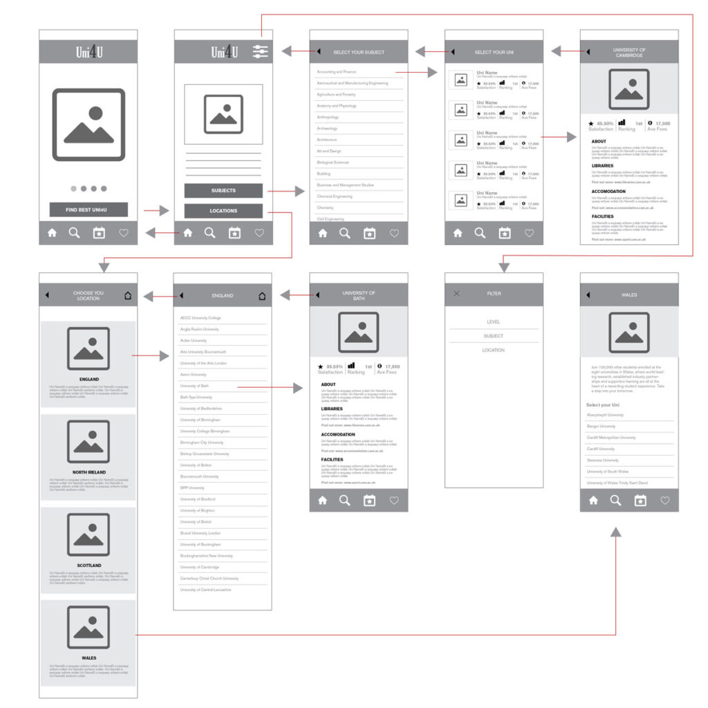
On the medium fidelity wireframes, I start to define specific elements and visual hierarchy. This gives more accurate depictions of the layout, and detail around how things will work.
HIGH FIDELITY MOCKUPS
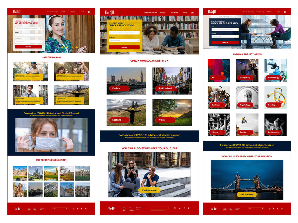
underneath is the high fidelity wireframes, I have included realistic typography, branding and colour. This take you as close as possible to a true representation of the user interface.


CONCLUSION
After working for an extended period in the HE sector, and looking closely at users’ requirements, while studying their goals, behaviours and search context I developed this website and app. It is a straightforward application, providing my users with the option to search either by location, subject or both. Some student/parents/carers search according to where they want to study, either close to home or somewhere more appropriate for their needs, e.g. close to family and friends, while others are looking solely for the most appropriate course/subject.
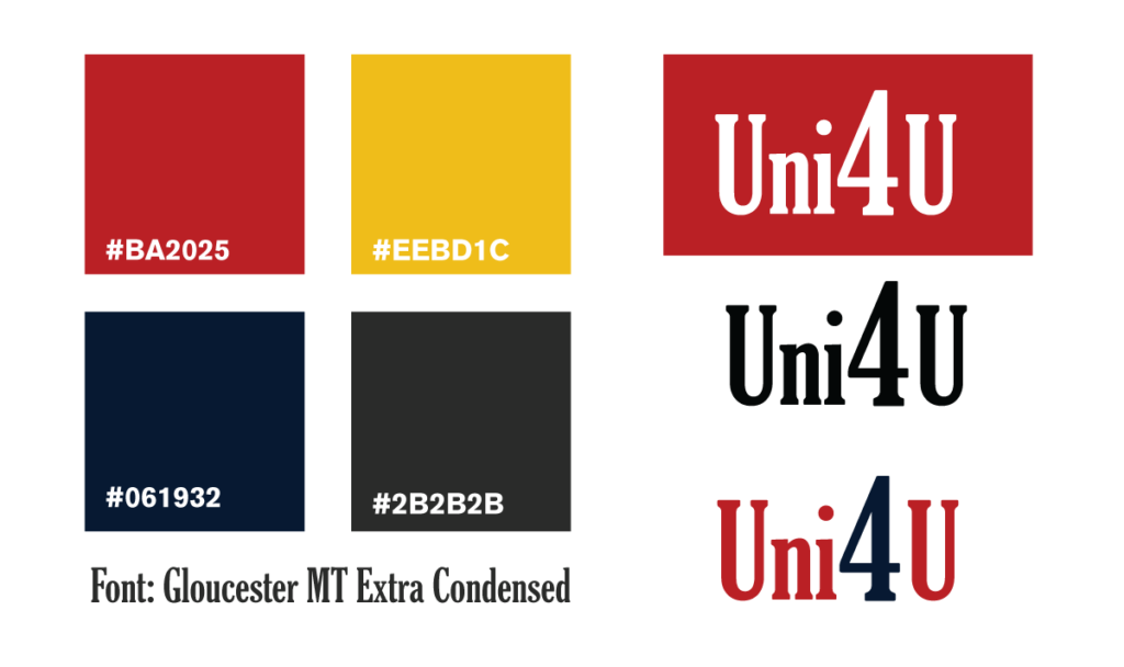
As 80% of my target audience are young adults, I have used bright colours such as red, yellow, and blue to grab their attention. I have also used icons that add visual accents to my digital design, they are powerful communications and are easy to understand by users and they save the screen real estate.
My main purpose is to design a one-stop-shop website and app where my users can find all the information needed about their best-fit university without spending their time calling or travelling, to find the information they need. This app and website covers subjects, university locations, university ranking, fees, as well as information regarding student life, accommodation, the library, bursaries, scholarships and more.
