
PROJECT BRIEF
Examine and address the problems faced by customers booking flights. I was tasked to lead and manage this project from start to finish while studying my online UX design course. It required research, including interviewing users, and the design of a new travel app as a solution to users’ booking issues.
The Problem
After undertaking qualitative and quantitative research, setting up some interviews, and a task for my users, I discovered that they found some aspects of the app unclear and confusing. Several factors are responsible for these perceptions and responses, starting with how the information is displayed, and including the Information Architecture of the app, CTA and navigation, and the use of colours. Sometimes my users became distracted and did not focus on being able to move through the sequence of actions to book a ticket quickly.
The Goal
Designing an app that is useful, easy and enjoyable to use. I wanted to enhance users’ experience and ensure that the user journey is easy to navigate, making booking flights a simple process.
Responsibilities
Qualitative Research, Note-taking, Usability Testing, UX Design, Visual Design, Wire-framing and Prototyping.
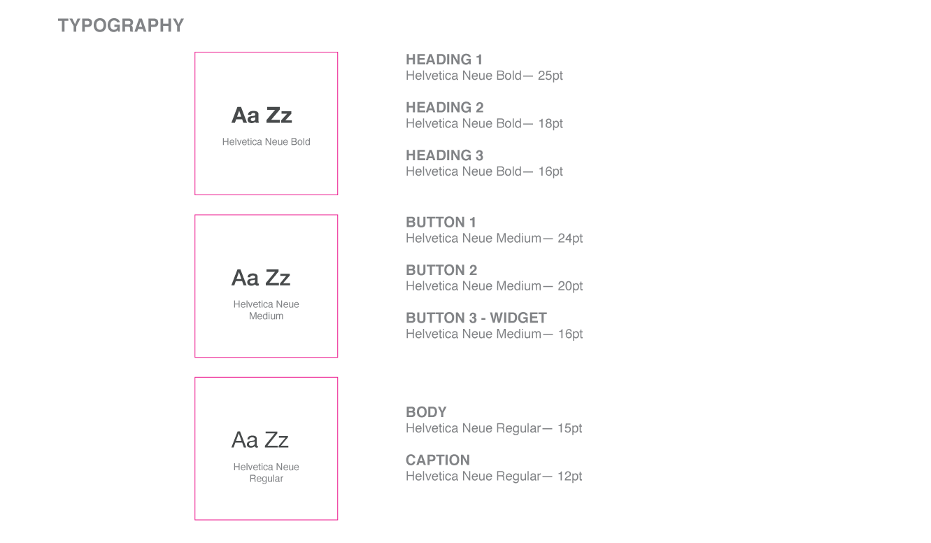
BRANDING


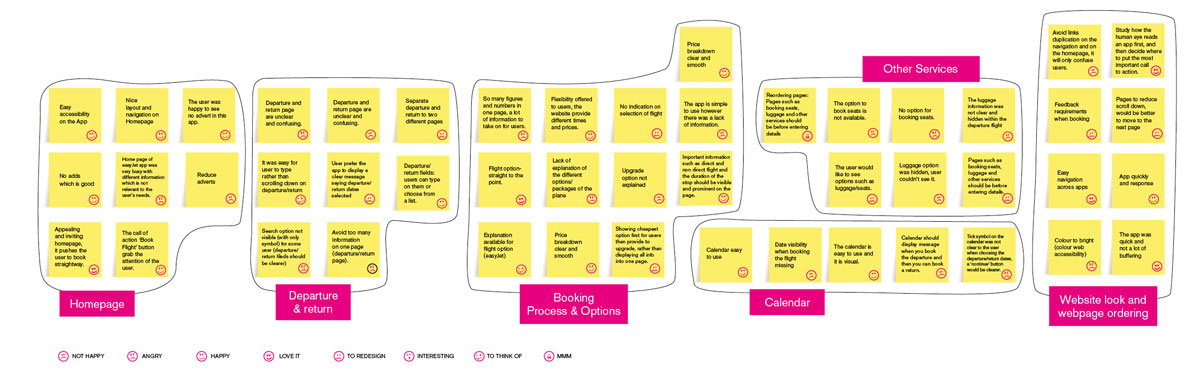
AFFINITY DIAGRAM
After gathering qualitative information (usability testing, surveys and observation) about my users, I have classified ideas and data together into meaningful categories. The purpose of this is to generate, organise, and consolidate information concerning my product.
USER JOURNEY FLOW
Creating UX flow helps me to understand the whole user journey and covering all the screens.
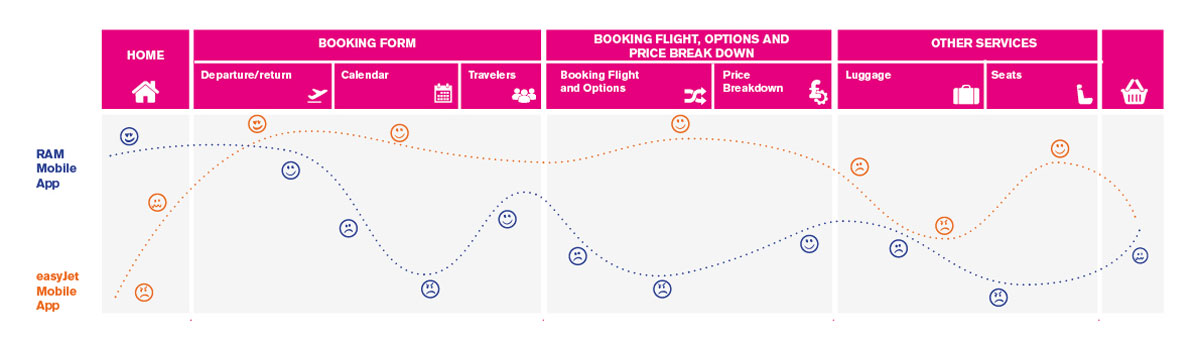
DIAGRAM
I have created user flow diagrams which display the complete path my users will take when using my app. This flow lays out the user’s movement through the app, mapping out each and every step the user takes—from entry point right through to the final interaction.

WIREFRAMES
Mid-Fidelity Wireframes

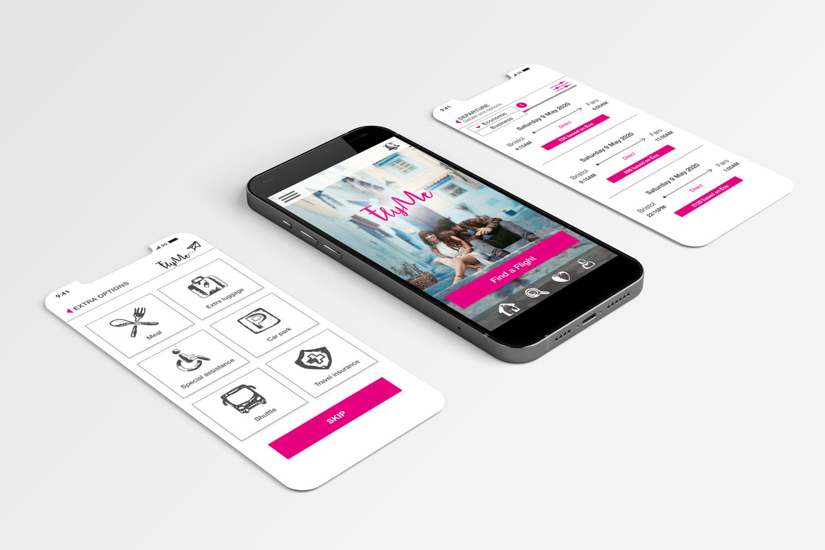
HIGH FIDELITY MOCKUPS
On my high fidelity wireframes, I have included realistic typography, branding and colours. I have also designed both static and interactive prototypes. these are better for soliciting feedback and doing usability testing.


CONCLUSION
I have come up with this app design after researching other travel apps (competitors), and studying my users’ goals, behaviours and context.
I have designed a simple, useful and easy-to-use app while using pictures, icons and colours to evoke positive reaction and appreciation so I can make it desirable to my users.
My core objective is to boost users’ experience and ensure that their journey to booking a flight is easy to steer, from start to finish. Therefore, this app is not only about desirability, but feasibility and viability, while ensuring its ability to meet and/or exceed a customer’s expectations for quality, reliability, and performance.